Belle II Software light-2405-quaxo
Correlation Class Reference
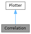
Inheritance diagram for Correlation:
Collaboration diagram for Correlation:

Public Member Functions

def __init__ (self, figure=None)
 
def add (self, data, column, cut_column, quantiles, signal_mask=None, bckgrd_mask=None, weight_column=None)
 
def finish (self)
 

Public Attributes

 figure
 create figure
 
 axis
 define first subplot
 
 axis_d1
 define second subplot
 
 axis_d2
 define third subplot
 

Static Public Attributes

None figure = None
 figure which is used to draw
 
None axis = None
 Main axis which is used to draw.
 
None axis_d1 = None
 Axis which shows shape of signal.
 
None axis_d2 = None
 Axis which shows shape of background.
 

Detailed Description

Plots change of a distribution of a quantity depending on the cut on a classifier

Definition at line 1057 of file plotting.py.

Constructor & Destructor Documentation

◆ __init__()

def __init__ (   self,
  figure = None 
)
Creates a new figure if None is given, sets the default plot parameters
@param figure default draw figure which is used

Reimplemented from Plotter.

Definition at line 1070 of file plotting.py.

1070 def __init__(self, figure=None):
1071 """
1072 Creates a new figure if None is given, sets the default plot parameters
1073 @param figure default draw figure which is used
1074 """
1075 if figure is None:
1076
1077 self.figure = matplotlib.figure.Figure(figsize=(32, 18))
1078 self.figure.set_tight_layout(True)
1079 else:
1080 self.figure = figure
1081
1082 gs = matplotlib.gridspec.GridSpec(3, 2)
1083
1084 self.axis = self.figure.add_subplot(gs[0, :])
1085
1086 self.axis_d1 = self.figure.add_subplot(gs[1, :], sharex=self.axis)
1087
1088 self.axis_d2 = self.figure.add_subplot(gs[2, :], sharex=self.axis)
1089
1090 super().__init__(self.figure, self.axis)
1091

Member Function Documentation

◆ add()

def add (   self,
  data,
  column,
  cut_column,
  quantiles,
  signal_mask = None,
  bckgrd_mask = None,
  weight_column = None 
)
Add a new correlation plot.
@param data pandas.DataFrame containing all data
@param column which is used to calculate distribution histogram
@param cut_column which is used to calculate cut on the other quantity defined by column
@param quantiles list of quantiles between 0 and 100, defining the different cuts
@param weight_column column in data containing the weights for each event

Reimplemented from Plotter.

Definition at line 1092 of file plotting.py.

1092 def add(self, data, column, cut_column, quantiles, signal_mask=None, bckgrd_mask=None, weight_column=None):
1093 """
1094 Add a new correlation plot.
1095 @param data pandas.DataFrame containing all data
1096 @param column which is used to calculate distribution histogram
1097 @param cut_column which is used to calculate cut on the other quantity defined by column
1098 @param quantiles list of quantiles between 0 and 100, defining the different cuts
1099 @param weight_column column in data containing the weights for each event
1100 """
1101 if len(data[cut_column]) == 0:
1102 b2.B2WARNING("Ignore empty Correlation.")
1103 return self
1104
1105 axes = [self.axis, self.axis_d1, self.axis_d2]
1106
1107 for i, (l, m) in enumerate([('.', signal_mask | bckgrd_mask), ('S', signal_mask), ('B', bckgrd_mask)]):
1108
1109 if weight_column is not None:
1110 weights = numpy.array(data[weight_column][m])
1111 else:
1112 weights = numpy.ones(len(data[column][m]))
1113
1114 xrange = numpy.percentile(data[column][m], [5, 95])
1115
1116 colormap = plt.get_cmap('coolwarm')
1117 tmp, x = numpy.histogram(data[column][m], bins=100,
1118 range=xrange, density=True, weights=weights)
1119 bin_center = ((x + numpy.roll(x, 1)) / 2)[1:]
1120 axes[i].plot(bin_center, tmp, color='black', lw=1)
1121
1122 for quantil in numpy.arange(5, 100, 5):
1123 cut = numpy.percentile(data[cut_column][m], quantil)
1124 sel = data[cut_column][m] >= cut
1125 y, x = numpy.histogram(data[column][m][sel], bins=100,
1126 range=xrange, density=True, weights=weights[sel])
1127 bin_center = ((x + numpy.roll(x, 1)) / 2)[1:]
1128 axes[i].fill_between(bin_center, tmp, y, color=colormap(quantil / 100.0))
1129 tmp = y
1130
1131 axes[i].set_ylim(bottom=0)
1132
1133 flatness_score = basf2_mva_util.calculate_flatness(data[column][m], data[cut_column][m], weights)
1134 axes[i].set_title(r'Distribution for different quantiles: $\mathrm{{Flatness}}_{} = {:.3f}$'.format(l, flatness_score))
1135 return self
1136
def calculate_flatness(f, p, w=None)
Definition: plot.py:1

◆ finish()

def finish (   self)
Sets limits, title, axis-labels and legend of the plot

Reimplemented from Plotter.

Definition at line 1137 of file plotting.py.

1137 def finish(self):
1138 """
1139 Sets limits, title, axis-labels and legend of the plot
1140 """
1141 return self
1142
1143

Member Data Documentation

◆ axis [1/2]

None axis = None
static

Main axis which is used to draw.

Definition at line 1064 of file plotting.py.

◆ axis [2/2]

axis

define first subplot

Definition at line 1084 of file plotting.py.

◆ axis_d1 [1/2]

None axis_d1 = None
static

Axis which shows shape of signal.

Definition at line 1066 of file plotting.py.

◆ axis_d1 [2/2]

axis_d1

define second subplot

Definition at line 1086 of file plotting.py.

◆ axis_d2 [1/2]

None axis_d2 = None
static

Axis which shows shape of background.

Definition at line 1068 of file plotting.py.

◆ axis_d2 [2/2]

axis_d2

define third subplot

Definition at line 1088 of file plotting.py.

◆ figure [1/2]

None figure = None
static

figure which is used to draw

Definition at line 1062 of file plotting.py.

◆ figure [2/2]

figure

create figure

Definition at line 1077 of file plotting.py.


The documentation for this class was generated from the following file: